otis.com Module Library
Welcome to the Otis.com module library
Please explore the module examples on this page to get ideas for how you might build your own webpage on Otis.com.

Hero Banner Title (H1)
Description text (optional). Almost all pages will have a hero banner at the top of the page.
Hero Banner Button (optional)
Short hero banner (H1)
Optional description text goes here. The short hero banner is a good option for lower-level pages.
Optional button
Tall hero banner (H1)
Optional sub headingThis is the description field. Use this tall hero banner option specifically for products and services.
This is a text strip (H2)
Here is the description text. This can be a couple of paragraphs long. This is a good spot for introductory text to introduce the content found on this page.
Here is the description text. This can be a couple of paragraphs long.
Button (optional)
Text strip with background image (H2)
This is the detailed description. Keep text to a minimum when using a background image, and make sure your contrast is high.
Text strip with background color (H2)
Here is where you will have your text. This is a good module for introducing a topic, if you have more than a 1-sentence description.
You can have two or three short paragraphs.
Text strip with image at center (H2)
Here is where you can write your description text.
3-column info cards (H2)
Here is where you can write one or two short sentences of description. The module can have two, three, or four columns.
Content heading (H3)
Content subheading is optional
Content description is optional, but recommended.

Content heading (H3)
This card doesn't have the sub heaading.

Content heading (H3)
The description of the card goes here.
4-column info cards (H2)
This is the description of your info cards.

Content heading (H3)
Here is the description of your card.

Content heading (H3)
Description goes here.

Content heading (H3)
This is the description for card 3.
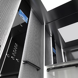
Content heading (H3)
Here is the description for card 4.
Horizontal info cards title (H2)
Here is where you can have your description text. This is optional.
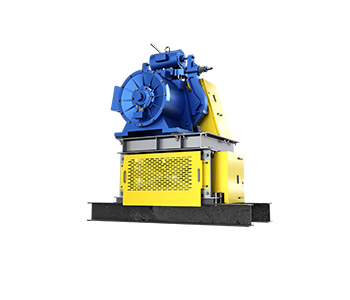
Content heading for the card (H3)
Here is the card description. This can be a couple of short sentences.
Button goes here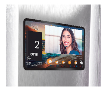
Content heading
Content description goes here. you can have several cards in this module, even though this example only has 2.
Buttons are optionalIcons - 2 columns (H2)
Here is an optional description, introducing the content below.

This is item number 1
Description goes here.

This is the second item
Here is the description for the second item.
Icons - 3 columns (this is an H2)
The description goes here. Optional. Display up to 4 icons in one row.

Icon one (h3)
Description for icon one. This description can be about this long. Don't make it too long.

Title for icon two
Do your best to make the descriptions for each icon a very similar length.

Icon 3 goes here
Here is the description for icon three. Again, keep it short, and in balance with the others.
Icons with descriptions to the side (H2)

ICON 1 TITLE
Description for icon 1 goes here. Try to keep all of the descriptions a similar length, so that each of the icons feels balanced.

ICON 2 TITLE
Description for icon 2 goes here. Try to keep all of the descriptions a similar length, so that each of the icons feels balanced.

ICON 3 TITLE
Description for icon 3 goes here. Try to keep all of the descriptions a similar length, so that each of the icons feels balanced.
Tiles - 2 column layout
Description goes here. We tend to use tiles at the bottom of a page, to link to other related pages on otis.com.
Tiles - 4 column layout (H2)
Here is the description text. These tiles are often used to link out to related content, child pages or siblings. Use 675x675 pixel images.
Alternate tiles module (H2)
This is the description area for the alternate tiles module.
Tile header is an H3
This is the tile description. Images for tiles should be 700x550 pixels. For the text, do not let it extend beyond the height of the image.
It can be more than one paragraph if you prefer.
Tile header for tile number two
Typically the alternate tiles module includes at least two tiles. Ideally not more than four.
You don't have to have a button with each tile. This one doesn't.
Card carousel title (H2)
Description goes here.

Title of card
Description of card one.

Title of card 2
Description of card two.

Title of card 3
Description of card three.

Title of card 4
Description of card four.
Info cards in carousel (H2)
Description for the carousel. This module is good to use for content that is secondary or tertiary. If the content is of primary importance, don't use a carousel, as it might not get seen by the user.
This is a Hubspot form (H2)
Here is your description text.
Title your video module here.
Put your video description here, please.

Tabs
Here is the description for your tabs content. This module is useful for linking to PDFs or to external sources. You don't have to have 3 tabs. you can have just 1, or 2, or more.


